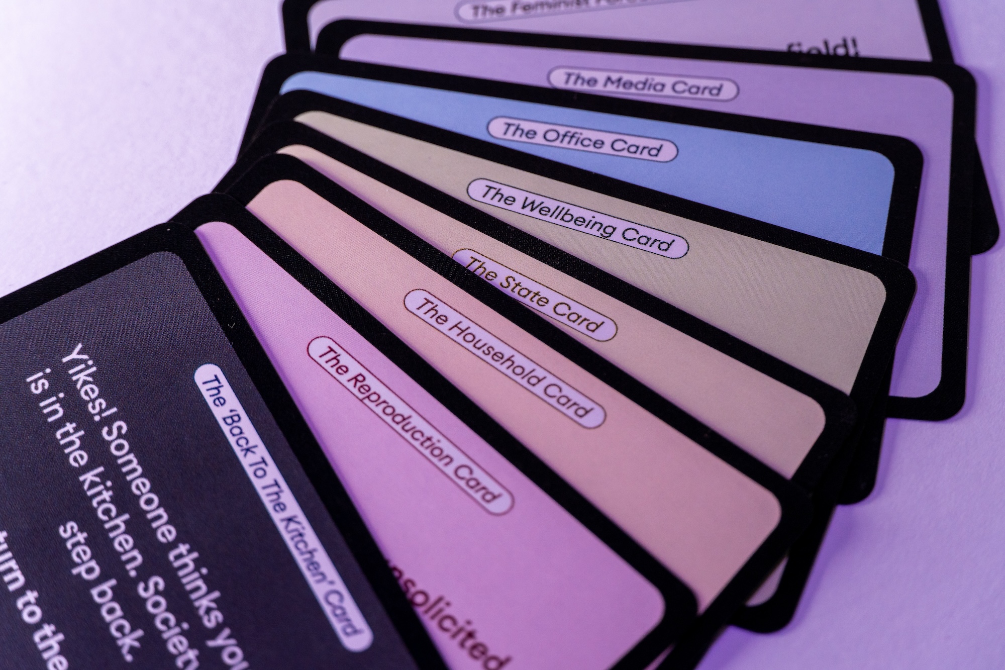
According to Walby, there are six structures where the patriarchy shows - broadly termed the patriarchal mode of production, patriarchal relations in paid work, patriarchal relations in the state, male violence, patriarchal relations in sexuality, and patriarchal relations in cultural institutions such as religion, media, and education-perpetuate systemic patriarchy (Walby, S. 1989) This theory has set the basis for my project, defining the characters, locations and challenges throughout the game.
Additionally, A major goal of mine throughout this project was to solve a few issues with board game packaging design. The issues are as follows: Wasted space = wasted materials / environmental impact, Frustrating repackaging of box, Storage issues, What to do with box while playing the game? As a result, a major part of my visual research was regarding the packaging and the user experience when unboxing and repacking the board game. A recurring theme in my early packaging sketches is box inserts, tabs for easy accessibility and simple storage.
The final logo was made to be reminiscent of a board game in its long path-like lines and curved edges — acting almost like a maze contained in a rigid rectangular shape.
The brand assets not only complemented the board game and its locations but also added a playful, childlike contrast to its serious, ironic commentary on real life. Featuring playful badges with reproductive organs, sensual emojis, and more, they provide fun, supporting visuals that double as inside jokes for parents—all while remaining kid-friendly.
A key element of the board game's brand and design is its wayfinding. These markers often relate to the board’s location spots but also bring a touch of supportive humour throughout the game. The wayfinding features a playful, cartoonish twist on real-life signage, echoing designs from street signs, highway directories, and even theatre signs with lightbulb edges. To support the Snakes and Ladders mechanics, I used swirly lines between “portals” that act as snakes, moving players around the board.


.jpg)

